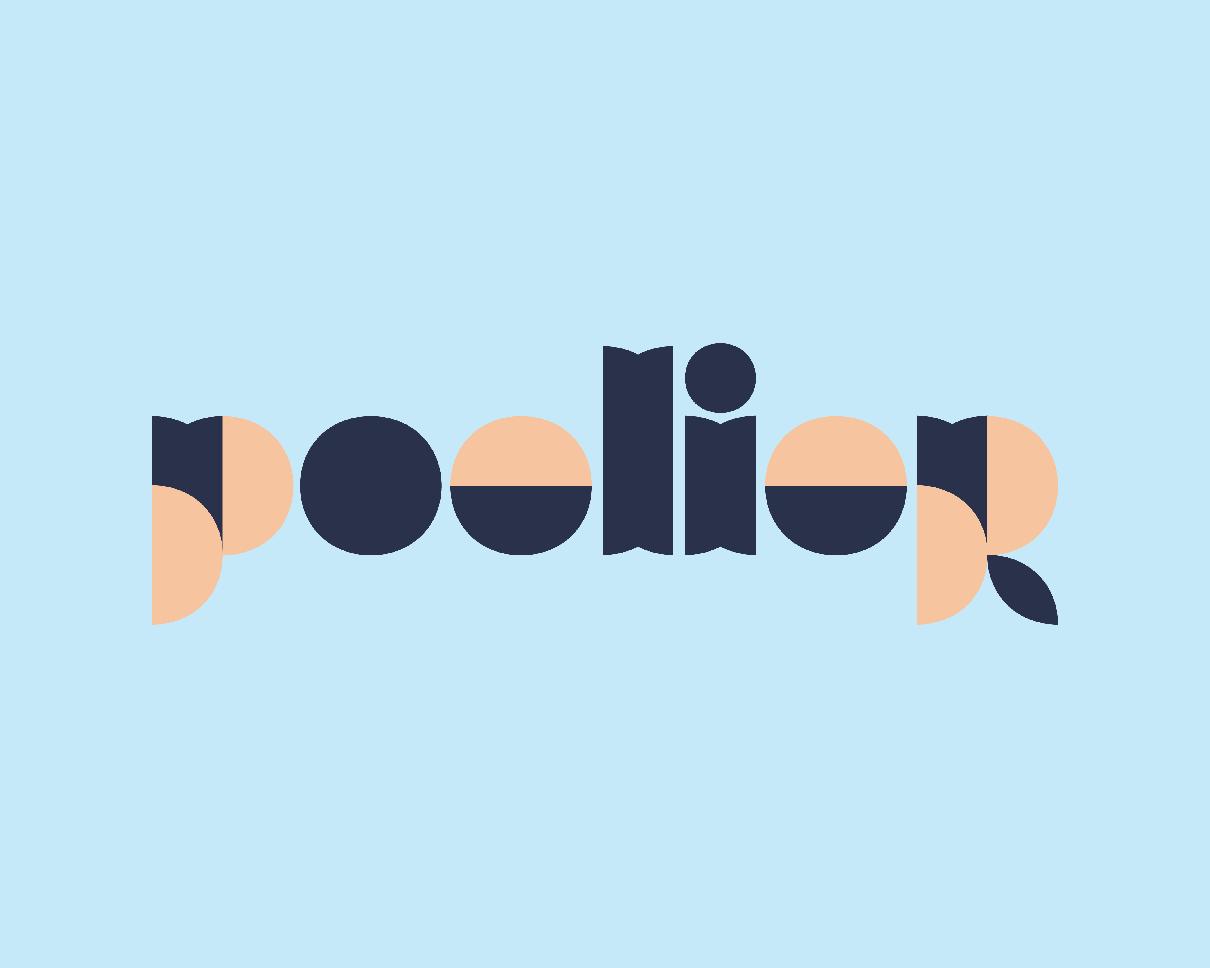
My work for the Poelier was, together with a 2 days deadline, challenging.
It had to be both a take away bar for your every type of poultry and an option to become a luxurious dine in place.
After a lot of different concepts, soft colours and round shapes was the way to go. I’ve created an art deco inspired typeface that could be spread out consistently throughout the brand. Whichever direction the Poelier will grow into the shapes will always be connected. For example if it’s packaging we can use the fresh light blue as a base. When it has to have a more chique feel we can work with the dark blue and a white base.
A Poelier is a place where you can pick up your poultry or dine in. The idea of the Poelier is to create a place for advice and tasting. When you decide to eat poultry you should really want to know that the animals lived their best life and that the poulterer takes care of the meat in the most delicious way.


